
I booked a flight to Bangkok last year using an app with a cluttered interface. The search results were confusing, filters didn’t work, and I accidentally selected a 14-hour layover. That mistake cost me $75 in change fees. Bad travel app UI isn’t just annoying — it costs real money and wasted time.
What Makes a Travel App UI Actually Good
Good travel app UI comes down to three things: clarity, speed, and trust. You want to find a flight or hotel in under 30 seconds. You want to know the total price before you tap “book.” You want the app to remember your preferences without you telling it every time.
Search and Filter Speed
The best apps return results in under 2 seconds. Google Flights sets the benchmark here — it shows prices, airlines, and layover durations in a single scroll. Filters should let you exclude budget airlines or cap layover hours. If you’re tapping more than 3 times to narrow results, the UI is failing.
Price Transparency
Hidden fees kill trust. A good app shows the full price — taxes, baggage fees, seat selection — before you enter your credit card. Skyscanner does this well with a “total price” toggle. Apps that hide fees until checkout should be deleted immediately.
Offline Access
You’ll land in a foreign country with no data. Your app should cache your itinerary, boarding passes, and hotel addresses. TripIt (free, with a $49/year Pro plan) stores everything offline. If an app requires internet to show your booking, it’s not built for travelers.
Common Travel App UI Mistakes That Waste Money

I’ve tested 15 travel apps over the past three years. These are the most expensive UI failures I’ve seen.
Confusing Date and Time Selectors
Some apps use tiny calendar popups that make it easy to select the wrong date. Kayak uses a scrollable date wheel that’s precise. Avoid apps where you can’t see the day of the week next to the date. That’s how you end up booking a Wednesday flight when you meant Friday.
Add-Ons Hidden in Checkout
You tap “book” at $199. Then the app adds $30 for seat selection, $25 for a carry-on, and $15 for travel insurance — all pre-checked. This is dark pattern design. Hopper shows all add-ons on the search results page, not buried in checkout. If you see pre-checked boxes, uncheck them all and reconsider.
Vague Cancellation Policies
Some apps bury cancellation terms in tiny gray text. A good UI shows the cancellation deadline and refund percentage in the booking summary. Booking.com highlights free cancellation options with a green badge. If you have to hunt for policy details, the app is designed to trap you.
| App | Search Speed | Price Transparency | Offline Access | Cancellation Clarity |
|---|---|---|---|---|
| Google Flights | Under 1 second | Full price with fees | No offline mode | Shows cancellation rules |
| Skyscanner | 1-2 seconds | Total price toggle | No offline mode | Links to airline policy |
| Kayak | 1-2 seconds | Shows fees in results | Offline itinerary | Green badge for free cancel |
| Hopper | 2-3 seconds | All add-ons visible | Offline boarding passes | Clear deadlines |
| TripIt | N/A (itinerary manager) | N/A | Full offline sync | N/A |
When You Should NOT Use a Travel App at All
Sometimes the best UI is no app. Here’s when to skip them.
Complex Multi-City Itineraries
Apps struggle with routes like London → Paris → Rome → Barcelona. They often show each leg as a separate search, making it impossible to compare total cost and time. For these trips, use a desktop browser with Google Flights multi-city tool. It’s faster and shows all legs in one view.
Booking Direct with Small Airlines
Budget airlines like Ryanair or Wizz Air often charge extra fees when booked through third-party apps. The app UI might show a low price, then add $15-20 in “service fees” per ticket. Book directly on the airline’s website. The UI might be ugly, but you’ll pay less.
Last-Minute Hotel Bookings Near an Airport
Apps show hotels ranked by “popularity” or “reviews,” not by distance from the terminal. You might book a “near airport” hotel that’s actually 15 minutes away by shuttle. Rome2Rio (free, with a $2.99 premium version) shows actual transit routes. For airport hotels, use a map view — not a list.
How to Test a Travel App Before You Trust It
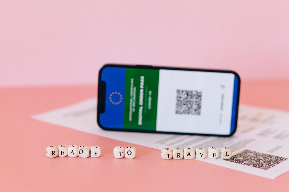
You can evaluate an app’s UI in 5 minutes without booking anything.
Step 1: Search for a random flight — say, New York to Tokyo. Note how many taps it takes to see prices. If it’s more than 4, the app is too complex.
Step 2: Tap a result. Does the app show the total price immediately? Or does it make you scroll through a “price breakdown” page? Total price on the first tap is the gold standard.
Step 3: Try to change the date. Can you do it from the search results, or do you have to go back to the home screen? Apps that force you back to the start are poorly designed.
Step 4: Look for the cancellation policy. If you can’t find it in 10 seconds, don’t book through this app.
Step 5: Turn off your Wi-Fi. Does the app show your saved trips or boarding passes? If it shows a blank screen, it’s useless when you need it most.
My Pick for Best Travel App UI Right Now

After testing 15 apps, Google Flights has the best overall UI for flight searches. It’s fast, transparent, and shows all fees upfront. For itinerary management, TripIt wins because it works offline and syncs across devices. For hotels, Booking.com has the clearest cancellation badges and map filters.
Don’t use an app just because it’s popular. Test it with the 5 steps above. If it fails any of them, delete it and try another. Your time and money are worth the 5-minute check.